http://www.halloween.com/
i found this website quite interesting and had great use of images used on the page but did not have enough. The colours really suited the theme and really looked like a halloween website. Although the information is layed out badly which makes it confusing to navigate around the website. Its also lacks discussion. its too boring and crouded.
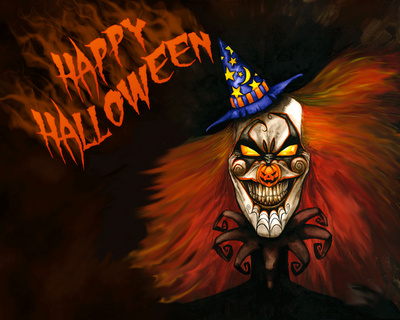
http://www.halloween-website.com/
this website is good because it has tabs, has specific content. Its also easy to navigate and its simple. The colours are awesome and the images go great with the theme. i dont like how the fonts are diffrent. Its hard to read because of the small writing and its not very clear.
http://www.scaryforkids.com/
i like the images used in this website. It has good content which go with the pictures. its too simple and boring, which lacks colour. It also needs to have a bigger font. It doesnt look interesting. Has to many ads at the top which hides the actual content. Not very attractive.
http://www.halloween-online.com/
This website has good content and litereracy. But is not specific enough and lacks images and colour . Its too plain and boring. The font is not eye catching including the size which is too small. The layout is also done very badly its too cramped. Although i like the way it has sub headings and is easy to navigate and find everything.
http://www.rexanne.com/hwn-sites.html
i love the background in this website, it really shows the theme. Its also easy to navigate. Although its missing colour and images to match the theme. Plus discussion telling us what the website is about . They have to many contents which makes it confusing and hard which one to pick.
Subject content
http://www.youtube.com/watch?v=_ZysEaHiY34&feature=fvw
http://www.youtube.com/watch?v=NijwK99OO04&feature=rec-LGOUT-farside_rev-rn-3r-8-HM


- history of halloween
- scary videos
- halloween costumes
- halloween jokes
- halloween tips
- halloween recipes
- pranks and tips
- superstictions